Client: Caspeco
Mission/Problem to be solved: The goal was to develop Dashboard-view in Caspeco Cloud that would help users to get better overview of their tasks in Caspeco Cloud and also display news that the are interesting for the user.
My role in the project: UI/UX Designer.
- Attend work meetings
- Research and try to understand the problems with current solution
- Ideation
- Sketching and visualisation of design concepts and iterate after feedback sessions with stakeholders.
- Interview and feedback meetings with 6 users representing different types of users of Caspeco.
- Documentation of design decisions and process.
- Collaboration with developers during implementation.
- Cooperation with Product Owner, developers and other stakeholders during the project.
Team: Product Owner, UI/UX Designer and Developers.
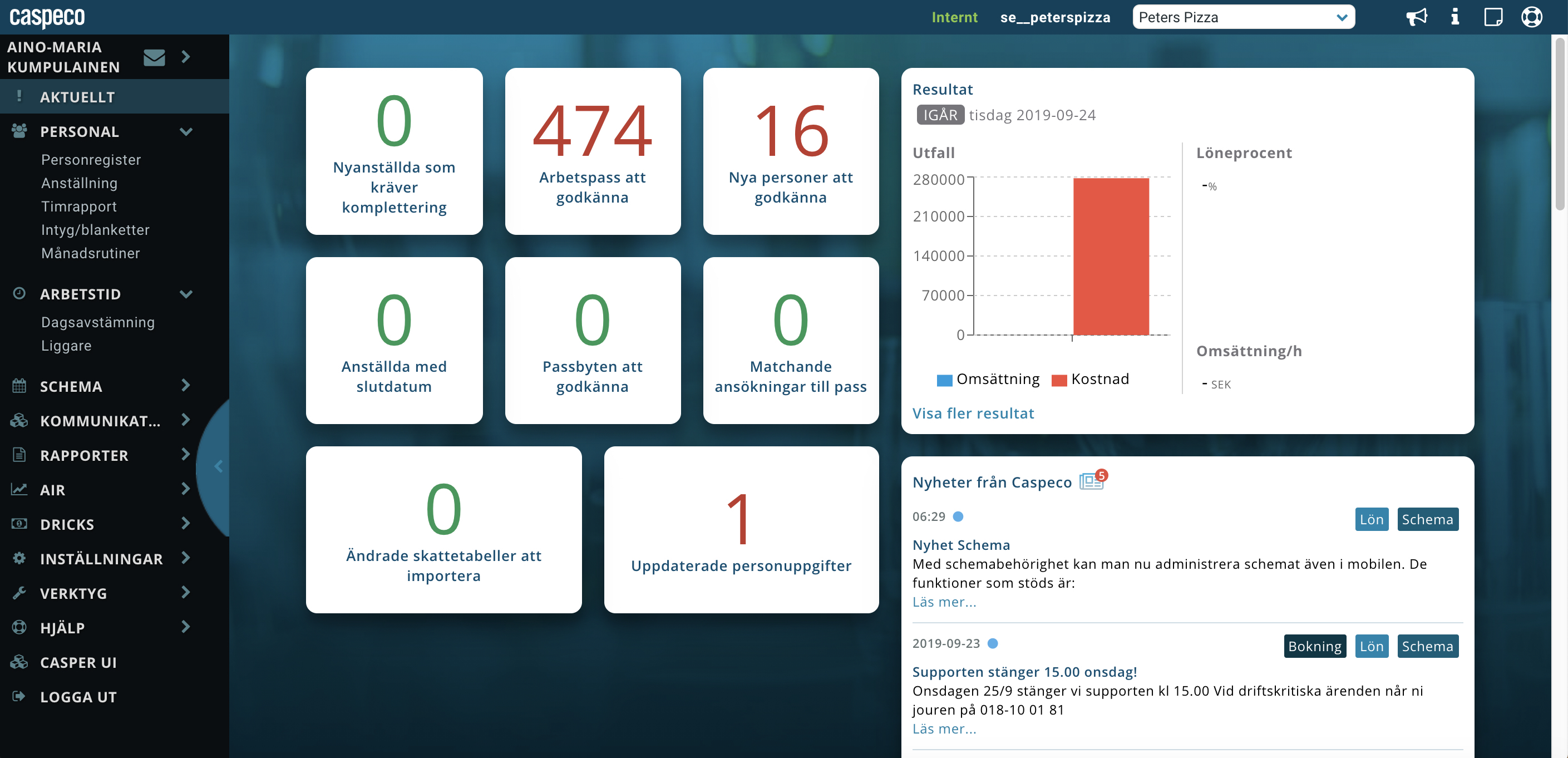
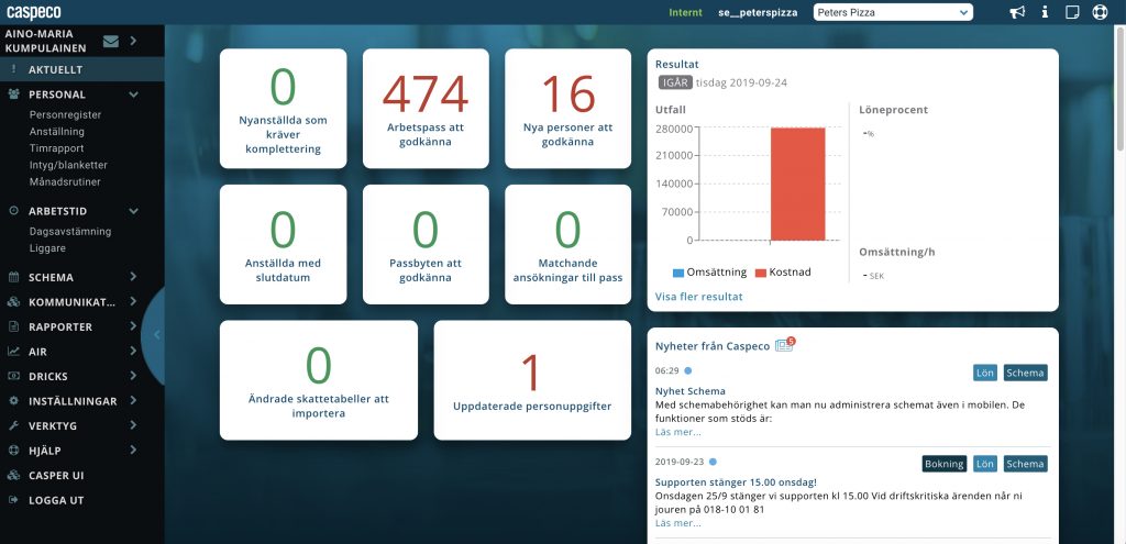
Screenshot from Caspeco Cloud:
- Action-buttons indicating how many actions needs to be taken. When the user clicks the button, a view is displayed where actions can be fixed.
- Graphs to give better overview and help user to understand how things are doing for the business.
- News that are relevant for the user and indicators for news that user has not read yet.
What I would do differently and develop further?
- Buttons should look more like buttons e.g. more 3 dimensional/clickable so that it’s easier for user to understand that they are buttons.
- Card titles and body text should have larger font so that it’s easier to read.
- Layout in Resultat card could be developed so that it’s easier for user to read and understand information.
Current version (top) and new design proposal (bottom)


